Unfortunately, most traditional agencies still rely on their, or the client’s, opinion to be the driving force guiding their marketing. Don’t fall victim to the HIPPO effect! Make changes only if the data shows it bolsters your conversions. If it doesn’t, don’t do it.
Looking for CRO ideas?
Visit our Conversion Rate Optimization library.
Vital Motion
Case Study | Two Years (2018 – 2020)
“Trust your gut” is usually good advice – except when it comes to CRO. See how testing helped Vital Motion’s Hummingbird take flight.
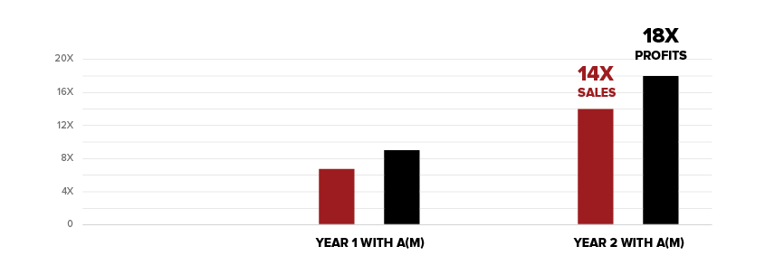
We didn’t just double or triple profits – see how we increased them 18 times over.
Draft Sharks
Case Study | 3 Years (2017-2020)
Draft Sharks learned that nothing, not even the brand aesthetic itself, is spared from our optimization tests. And for good reason.
See how we optimized their visitor funnel for 260% more conversions.

Vital Motion
Time Frame: Two Years (2018 – 2020)
1,739%
Increase Gross Sales ($)
14x
Increase in Number of Sales
Testing-based optimization boosted Vital Motion’s conversions and profits – getting their Hummingbird flying!
Background
Vital Motion is the creator of the Hummingbird, a device that provides fibromyalgia symptom relief by means of plantar stimulation. The Hummingbird is truly a novel invention; registered with the FDA as a “Class 1” medical device and backed by clinical studies, it is the first – and only – device offering fibromyalgia symptom relief.
Challenge
Given the Hummingbird’s unprecedented nature and sizable financial investment, people were hesitant to purchase. Fibromyalgia is a disease that affects everyone differently, and just because the Hummingbird provides relief for some doesn’t mean it is universally effective. Although Vital Motion was working with a large digital marketing firm to launch the Hummingbird, the combination of uncertainties was too much, bringing just 303 sales in the first 12 months. Clearly, there were some kinks in the sales funnel that their current agency was not addressing, so Vital Motion reached out to a(m) to optimize their offerings and boost their sales.
Our Solution
Profitability Testing
1,739% INCREASE IN GROSS SALES
Through the systematic testing of offers, payment plans, and advertising channels, we found the right combination of CTAs, guarantees, and ad variations that had Hummingbirds being sold faster than they could be made!
One of the biggest, most dramatic metrics to optimize was price. For Vital Motion, it was more than just trying to find the highest conversion rate – it was about finding the most profitable price point. Because there aren’t any other comparable products on the market, we had to discover a balance that would be fair and enticing to consumers while also creating a sustainable profit margin. We tested two offers in the hopes of finding a pricing sweet spot: the original price of $295 versus an offer of $395. Conversion tracking on A/B testing showed that the higher price point only dropped the conversion rate by 6% – while increasing per-unit profit by 85%. This showed that a higher price meant better profits, even if that means losing a portion of the consumer market.

Once we found the right price, we then tested to see if we could gain more sales by offering payment plans. This aimed to sway buyers who may be on the fence about the product’s effectiveness; without the large up-front investment, the risk is diminished while the reward remains the same. We tested 4 payments of $99 against 3 payments of $129. The 4 installment payments ended up outperforming by 17.2%. We had found our winning combination.

Ad Testing
14x MORE SALES
We also wanted to see what the best channels were for reaching our target audience, now that we knew what to offer them. We tested Google pay-per-click advertising against targeted Facebook advertising over the course of the first $10,000 in ad spend. Given the target demographic, we saw better results via Facebook advertising, with an average CPA that was $32 cheaper than Google.

To help determine how “new” viewers, who aren’t looking for the product, respond best, we performed an A/B test of all paid traffic on Facebook and Google. We set up ads that were linked to the landing page and then redirected that traffic to the home page 50% of the time. This allowed us to get sufficient traffic in order to get a statistically significant result. The outcome: paid ads that brought searchers to Vital Motion’s home page had an 11% higher conversion rate than when those same ads took users to a landing page. While this is uncommon overall and goes against what “best practice” tells us, we realize that sometimes landing pages aren’t the top performers when it comes to complicated, trust-based sales. This was certainly true in the case of the Hummingbird.

Over time we were able to continue to optimize the ads themselves, testing 10 variations of text ads and 3 variations of video ads. By continually monitoring ad engagement and conversions, we were able to find a winning combination of headlines, descriptions, and urls that shared to right message to the right demographic at the right time. We were eventually serving text ads with a CPA of just $51 and video ads with a $42 CPA. Talk about ROI!
Once working with a(m), Vital Motion ended its second year with 14 times more sales at a higher price point – and roughly 18 times more profit!

Draft Sharks CRO
Time Frame: 3 Years (2017-2020)
260%
Increase in Total Conversions
$160,000
Annual Revenue Increase
Savvy CRO decisions helped get Draft Sharks to the end zone with their new subscribers.
Background
Draft Sharks is a nationally recognized Fantasy Football advice website, providing top-notch advice to football enthusiasts. They offer a host of free tools, including mock drafts, depth charts, and average draft positions for all major players, as well as even more “insider only” tools and tips.
Challenge
Draft Sharks had a goal of selling more subscriptions for their fantasy football insights. Much of their content is gated to non-members, so Draft Sharks knew the publicly available portions of the website, paired with their email marketing campaigns, had to entice individuals into becoming paying subscribers. They enlisted Accelerate Media’s help in optimizing all aspects of the conversion touchpoints, including price, language, design, and more.
Our Solution
Offer Optimization
46% HIGHER CONVERSION RATE
The Draft Sharks team seemed confident that their price of $19.99 was set in stone, but we at a(m) knew to let the tests do the talking. In actuality, testing showed that raising the price to $24 resulted in a 46% higher conversion rate. The Draft Sharks team was floored! This one test helped to realize an extra $160,000 in annual revenue – and cost less than $1,000 to run.

After seeing such impressive success with pricing tests, we decided to try adding a 20% off offer. The hope was this would act as an extra enticer for users who were still trying to make a decision. Testing showed that it only increased conversion rates by 6%, and ultimately made the price point less profitable in the long run. So, we decided against implementing it. While we may have missed the extra point on this one, we still got the touchdown.
Copy & Design Variation Testing
145% HIGHER CONVERSION RATE
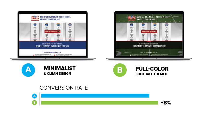
The aesthetics of a website are sometimes overlooked as a conversion factor, but not by us. Clean designs with ample white space are becoming quite popular, so we decided to test a minimalist design against a full-color, football-themed look. For this particular audience, bold was big, and the vibrant, Draft Sharks design increased conversion rates by 8%.
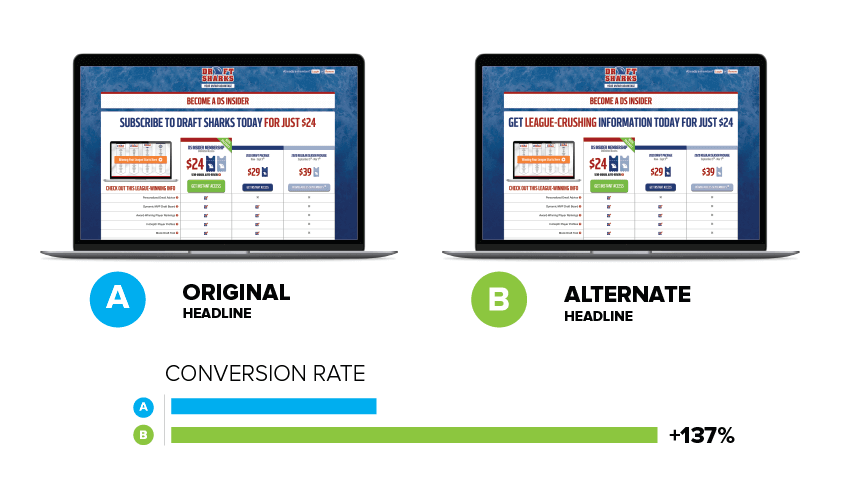
Of course, looks aren’t everything – the message is equally important. Analytics showed us that there was a decent flow of traffic to the subscription page, but not everyone who made it there was following through. We decided to do a classic A/B test on the headline of the subscribe page. The original, Subscribe to Draft Sharks Today for Just $24, was alright. The alternative, Get League-Crushing Information Today for Just $24, was indeed league-crushing. The variant won over the original with an increased conversion rate of 137%!
Home & Landing Page Testing
128% INCREASE IN PAID MEMBERSHIPS
Video creation and testing played a huge role in final optimization outcomes. Because potential buyers couldn’t see the benefits offered by becoming a member, a(m) created a series of explainer videos that allowed people to see “behind the curtain.” We tested various scripts and productions for engagement and conversion rates, with the winning videos bringing a 128% increase in paid memberships. Once we found our winning video, we made sure it was perfectly placed, running home page tests comparing it against winning copy. Compared to other content, the video increased the conversion rate by 28%.
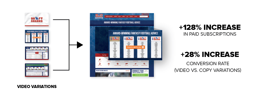
We knew we would be able to sufficiently target our key demographic with Google search ad and that the homepage was well optimized, but we were unsure how new users were most comfortable completing the sale. How much information did they need? How much of the site did they click around on before committing? As you can probably guess, we decided the only way to know was to test it. We set up ads that were linked to a contained, navigation-less landing page and then redirected that traffic to the home page 50% of the time. This gave us a sufficient amount of traffic to ensure a statistically significant result. The outcome: a simpler, all-inclusive, distraction-free landing page increased the conversion rate by 41%.
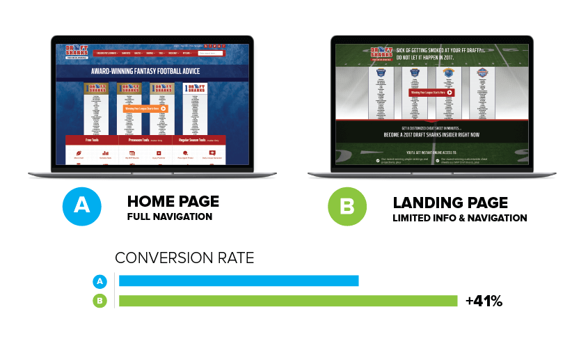
By the end of our optimization testing, we were able to realize a 260% increase in total conversions while also increasing the profitability of each subscriber.
“Every time we think we’ve reached peak performance, Accelerate Media shows us all the ways little changes can have a MAJOR impact on our conversions. They really do test everything.”
Conversion Rate Optimization
Some agencies think of CRO only in terms of increasing the percentage of folks performing the action you want them to on your website. While this is true, we like to think of it in a slightly more user-centric way. Instead, our CRO services experts view CRO as the process of understanding what entices, persuades, and captures a user’s attention and then optimizing it—providing a positive experience that makes converting a no-brainer.
CRO Best Practices
The idea of “CRO best practices” is sort of an oxymoron. After all, the point of CRO is to test EVERYTHING to learn which specific elements are working for each specific situation. Best practices may offer a jumping-off point, but they are certainly not static across markets, industries, audiences, or platforms.
In a way, “best practices” are just something that worked for someone else in the past. There’s no definitive guarantee that it will work for you and your site, which is why we focus on the one thing that will tell us what works: testing. Trust one of the best CRO companies in Rochester NY to provide you with the best CRO results.
A/B Testing for CRO
The CEO likes orange, but the head of the marketing team likes blue. What color should your CTA button be? Whatever color performs best—and it might just be green. Our Rochester conversion rate optimization experts test all major conversion touch-points, including positioning language, CTA language and placement, prices, sales or specials, and so much more. We utilize a wide range of tools to measure traffic, track clicks, view user sessions, and, ultimately, determine what’s working and what should be further optimized.