Any good article about accessibility has to mention the WCAG Accessibility guidelines. But let’s be honest, who has really taken the time to read them ALL?
Are there a few hands going up somewhere in cyberspace?
There’s a pretty good chance that you might be familiar with them, but you likely haven’t read through the whole thing word for word – after all, it’s quite long and full of technical details. Instead, we’ve found Nielsen’s 10 Usability Heuristics to be a more digestible way to approach the same information. But, after spending hours looking through these resources, it felt like we were left with mere knowledge. Sure, we can apply it in web projects we’re working on, but it lacked some impact and innate motivation for us.
We began to wonder WHY these guidelines are so important. Why are some web and UI designers OBSESSED with contrast? After all…it looks fine to us. We can read it. Maybe it’s just a more “subtle and textural” element.
Why should we care about these guidelines?
Why should designers and reviewers spend the extra effort to adhere to these guidelines? Does it really make a difference?
Obviously, the answer is yes. We want all our content to be accessible to reach as many people as we can. By taking human diversity into account, we can actually take a few simple steps to make things better for EVERYONE.
We’ve pulled together some statistics that have helped us frame this topic in more human terms – measures that we can relate to and empathize with.
Should I really be designing with disabled communities in mind?
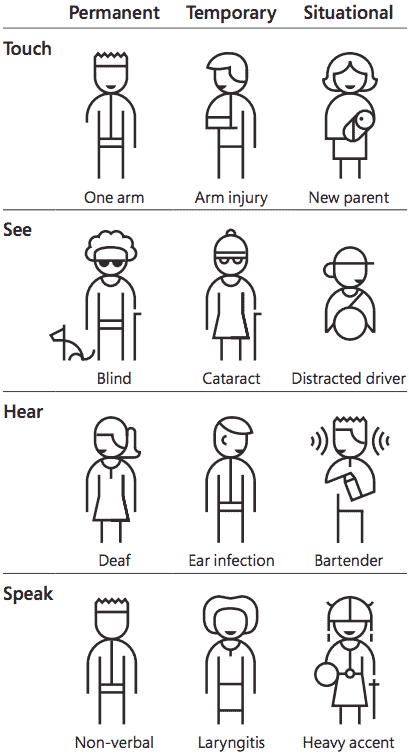
We know that question sounds a bit harsh and prudish, but we ask it anyways. Can we really justify spending hours (aka client’s money) on making sure we’re taking these considerations into account? It’s a noble pursuit, but practically, can we justify it? To help answer that, we turned to Kat Holmes’ Persona Spectrum, which shows permanent, temporary, and situational disabilities.

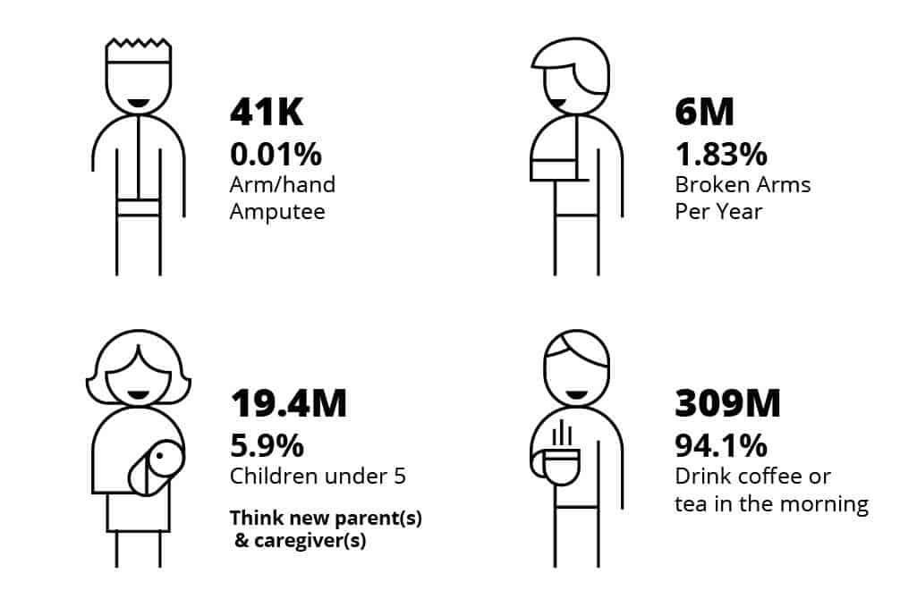
Let’s break down Touch into some actual numbers, focusing on the US population.

Clearly, designing for “one-handedness” doesn’t seem like such a “minority” anymore.
The Personal Spectrum chart had a profound effect on us. True, we likely aren’t interacting daily with anyone with one arm (permanent disability). That’s hard for us to empathize with. However, we know a coworker who broke their wrist a few weeks ago (temporary disability). Have we ever tried to use our phones with one hand because we have coffee in the other? You betcha. That’s situational disability. Even if we can’t explicitly empathize with permanent disability from our own experience, we think it’s safe to say many of us experience situational disabilities on a daily basis. Imagine what it would be like to ALWAYS have that challenge to overcome.
Design for that scenario.
It will take some extra effort. But we think you’ll find that your final product will be much better, more streamlined, and more usable for more people because of your shifted mindset and added effort.
Are long pages really a problem?
Clients love talking about their product/service. We’ve gotten more than a few requests of, “We need to mention (insert tagline, cool idea, or additional offering) on the website somewhere.” It’s easy to respond with, “We’ll just add that to this page. The content will get a little long, but it fits.”
Great. Your client is satisfied. However, it’s probably not the best idea considering the average attention span of users and average time on page:

Bringing this back to inclusion and accessibility, imagine going through one of those long pages using a screen reader. If you’ve never seen a screen reader being used, Smashing Magazine did a screen capture interview with Léoine Watson. You’ll be much more sympathetic after watching just a few minutes of it. We got exhausted just thinking about our typical browsing habits using this kind of assistive technology.
Condense and hone your message. “Fluff” only dilutes what you really want to communicate. Get to your point.
Why is contrast important?
Simple – because users need to be able to read your content. This seems like a no-brainer, but if the contrast is too low, some of your users won’t be able to engage with it. Here are some stats:

Applying this to our own work: do we know someone who’s legally blind? Not necessarily. Not terribly surprising given that only 2.3% of the population reports a vision disability (US Census Bureau). However, do we know someone who’s colorblind? Yes. Do we know someone who can’t read an email without their glasses? Absolutely. We can empathize with that.

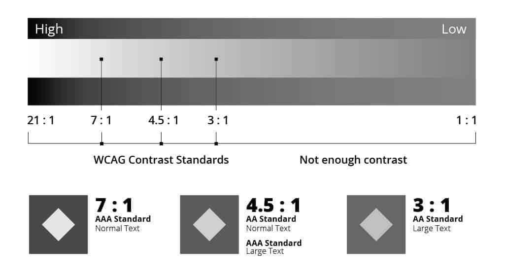
If there isn’t enough contrast, those 8.8% of people with colorblindness CAN’T see the diamonds with low contrast in the illustration above. It’s not just hard to see – it’s impossible. Avoid using a treatment with a low contrast ratio for any content that’s even remotely important to your messaging – it’s a bit like invisible ink to some of your website visitors.
You might be wondering what those numbers (8:1, 2.5:1) are under the diamonds. Those are the contrast ratio. The higher the first number, the greater the contrast. (Confession: We’ve got one of those contrast-obsessed designers on our team.) Thinking about this in black and white is a little easier to visualize when it comes to complying with the WCAG standards.

When tossing color into the mix, maintaining that contrast ratio requires even more conscious decision making. But the concept of contrasting values remains the same. We use WebAIM’s contrast checker to make sure that the colors we’re using have the contrast ratio visitors need.
We need more (insert demographic) people in this image.
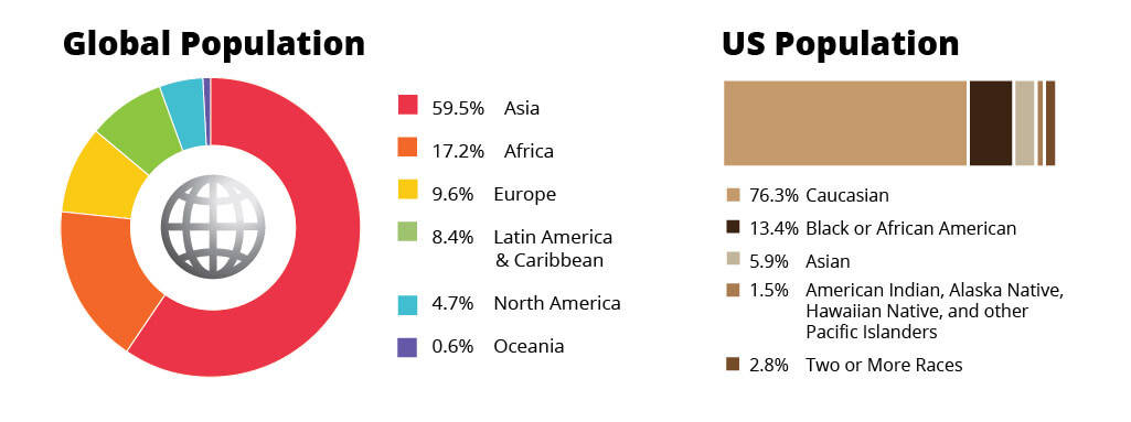
A few of our clients are increasingly concerned with showing diversity in their artwork and images across their site. As designers, we make hundreds of decisions when doing layouts and creating artwork that gets shared with our clients, and we wanted to have a practical way of measuring the “accuracy” of how diverse an image or page should be. Below are some demographic stats and one of the ways that we think about measuring “accuracy.”


That being said, there are definitely campaigns and initiatives that are targeted to reach certain demographics, ethnicities, and locales which would shift the needle in one particular direction or another. For us, we like having the big picture as a baseline. So, if we’re featuring more than 2 people in an image or page, there should be a variety of skin tones.
So what now?
After all the stats, here are our big takeaways for designing for diversity:
- Consider what permanent, temporary, and situational disabilities apply to your specific project. You may find that focusing on the permanent level of the disability helps bring the real user perspectives into more vivid detail.
- Streamline your message. Think about attention span when you’re editing page content. Make sure everything has a good reason for being there.
- Make sure you have enough contrast on your text, icons, and any other interactive elements. Think of this as avoiding writing in invisible ink for 8.8% of your users/visitors.
- If you’ve got more than 2 people in an image or page, there should be a variety of skin tones. The stats back it up on both global and US-focused levels.
You might be saying, “That sounds like merely good design sense…it doesn’t really have anything to do with disabilities.” In many ways, that’s our point. Many of these suggestions may come out of optimizing text for screen readers or making sure there’s enough contrast for low-vision users. Yet, the truth is, these “accommodations” make it better for ALL users. By considering the seemingly unique needs of a specific user group, we’ve discovered that many other users experience the same pain-point, just to a lesser degree.
There are many other areas to explore on this topic. This article just starts scratching the surface about diversity and accessibility in web design. But, to sum it up as concisely as we can:
Embrace diversity. Find a way to empathize with your users.
Your users are the whole reason that you have a website or are developing a software platform. Don’t make it hard, uncomfortable, or impossible for them to use it.
